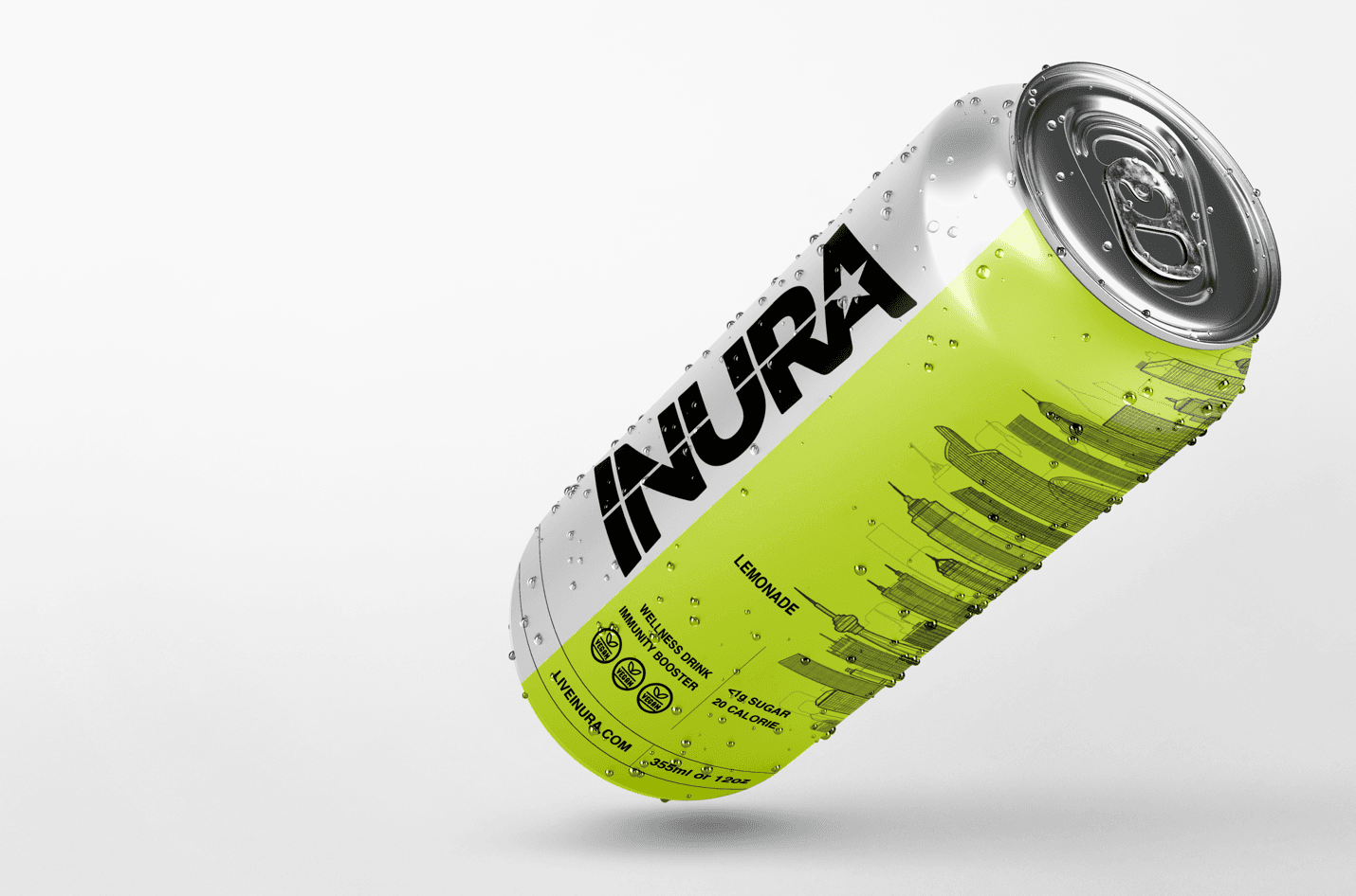
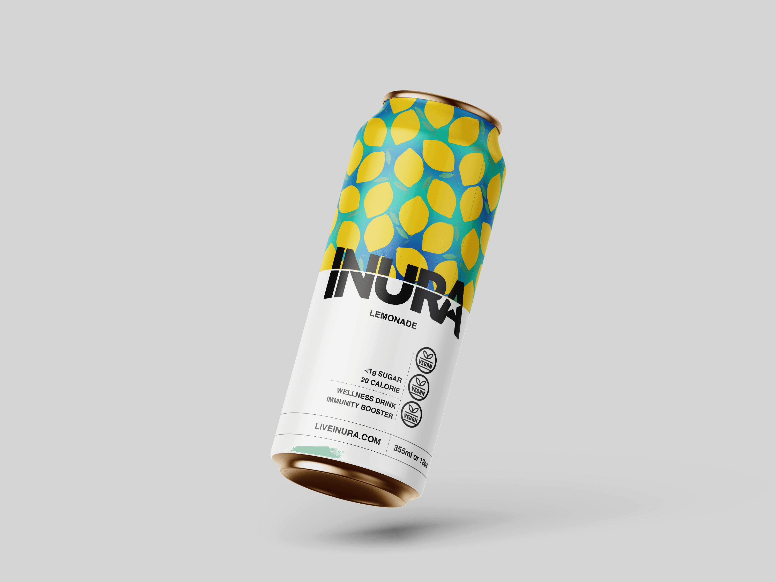
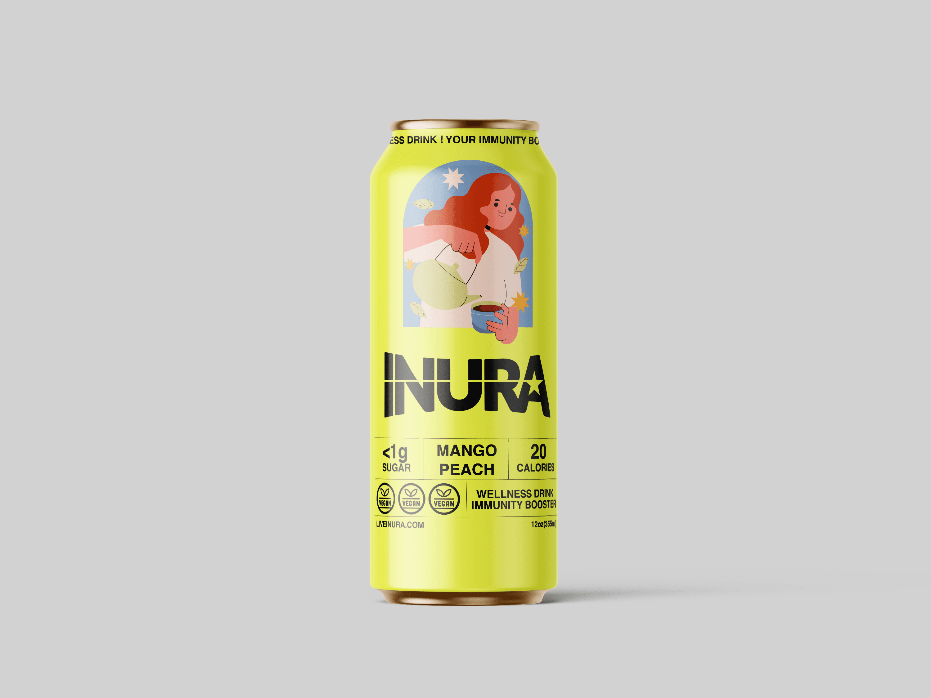
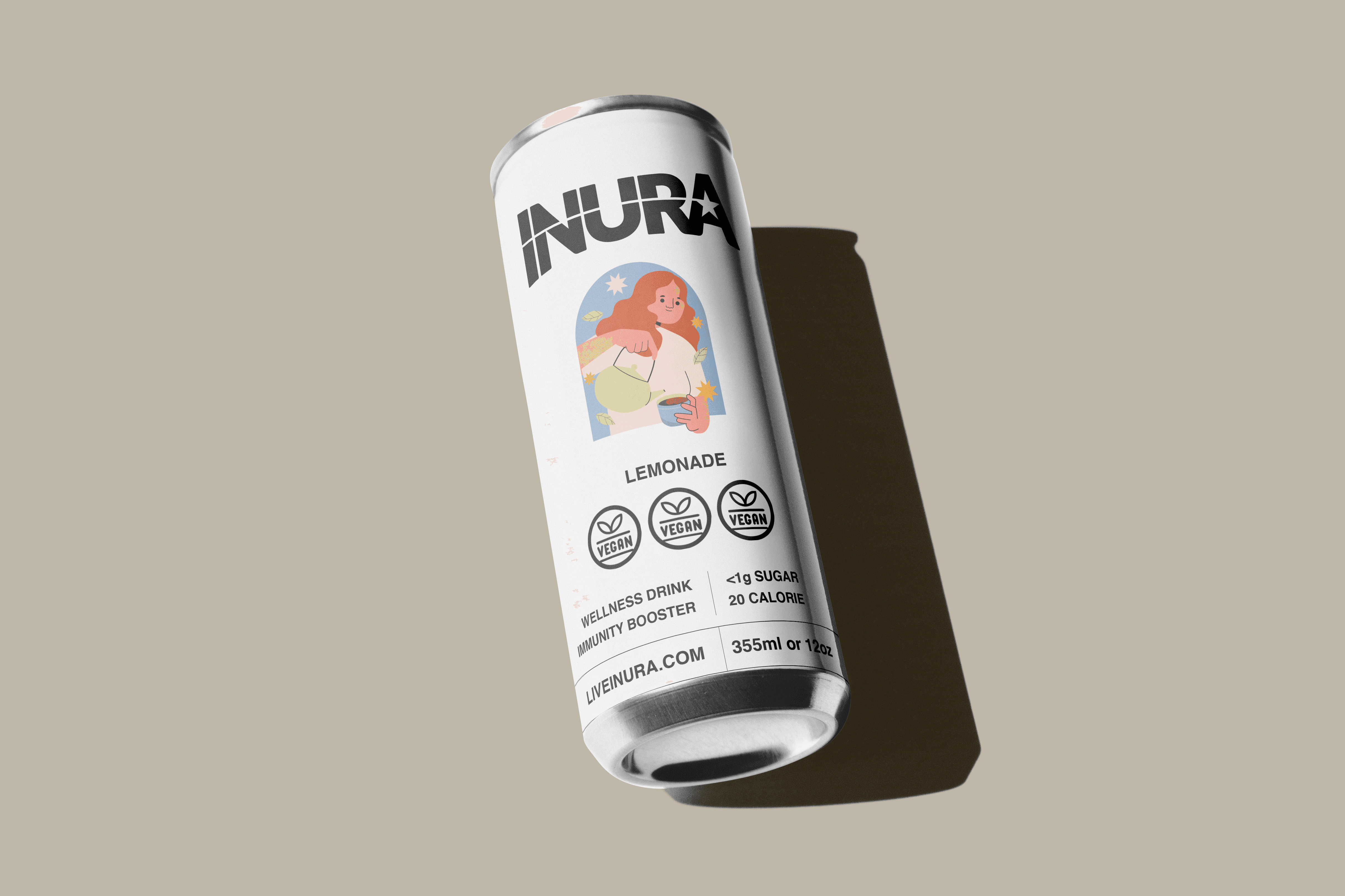
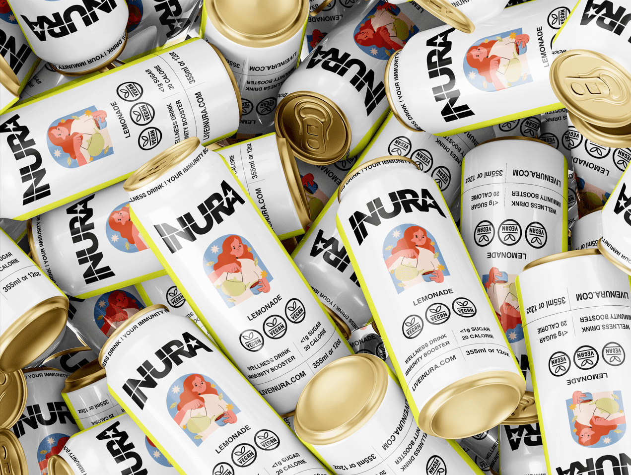
Packaging Design For INURA, A Beverage Company Start-Up in its Phase 1, Here The Goal was to help make it stand out on the shelves and create it's Packaging Identity.
Client
INURA
Role:
Packaging
Duration:
1 Week
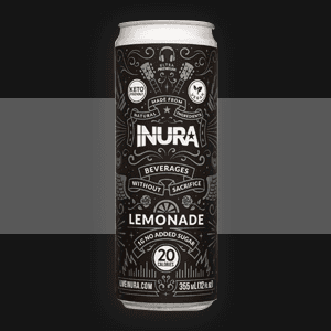
This project posed a unique challenge that required multiple phases of ideation. The goal was to help the product stand out on the shelves and create its own packaging identity. The previous packaging was very dark and cluttered, so this time, the focus was on creating a more clean and cohesive look that could also complement the brand's nutritional aspect as an herbal drinks brand.
Guidelines From The Brand
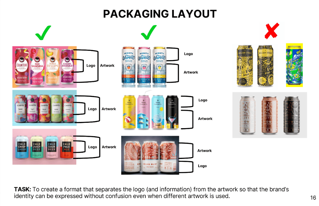
Here are some guidelines from the brand, As it's a Tea/Soft beverages the use of vibrant color pallet and Do's and Dont's,.
Design & Placement
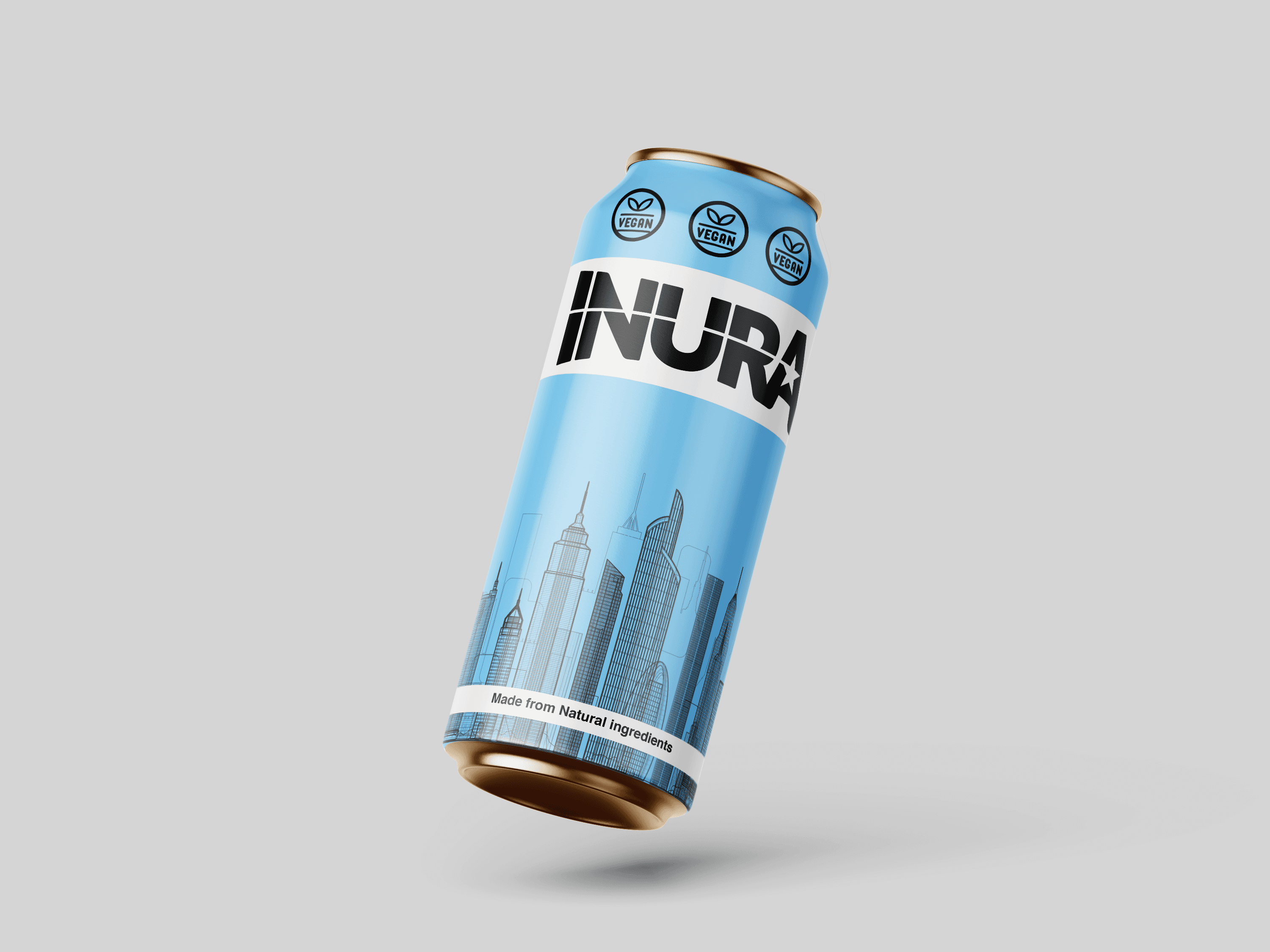
The first trial of making a base & where to place important brand elements.
Different Format
using different placement and format options, also adding more relevant information
A different view
In case the project is viewed in a horizontal view.
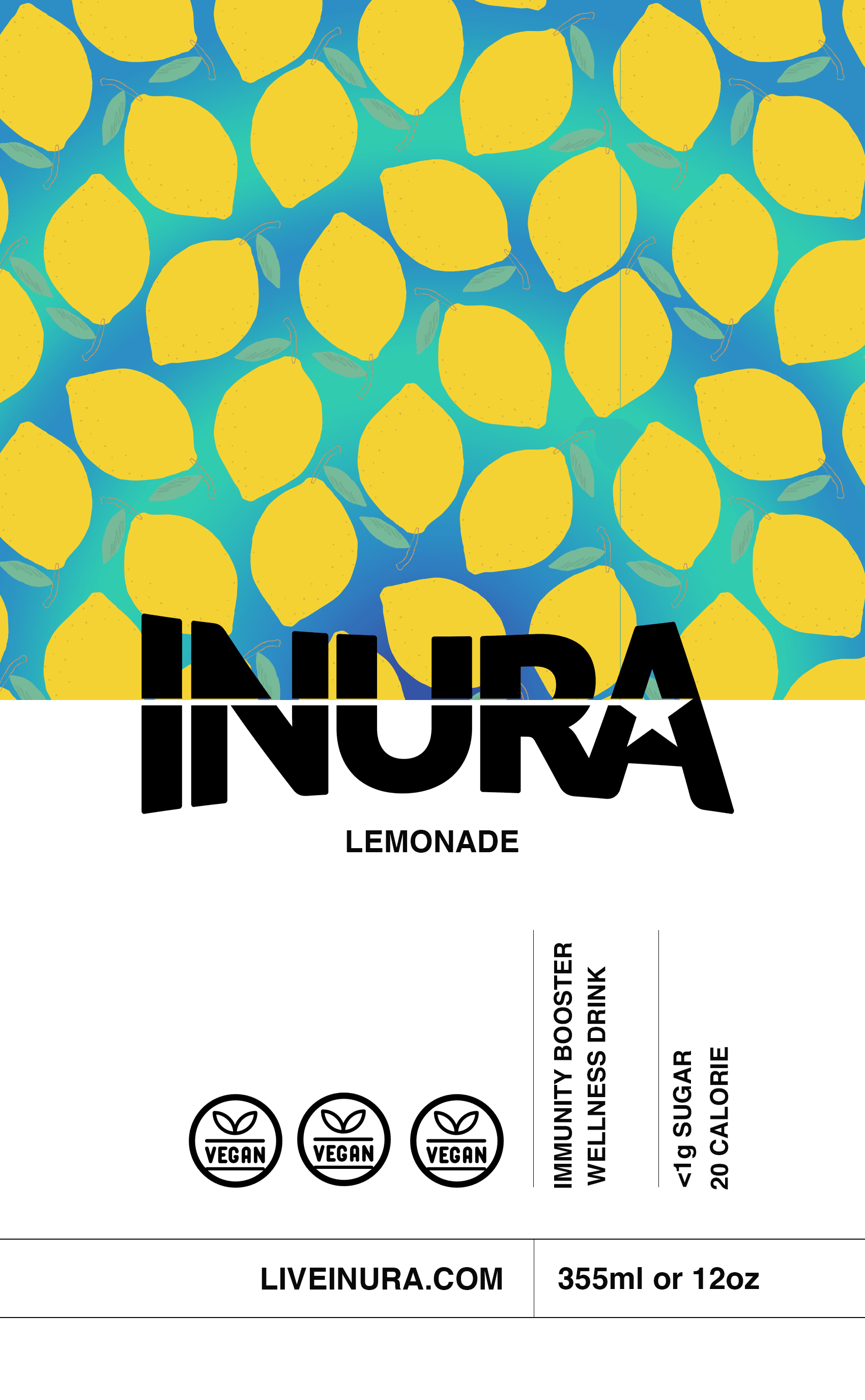
Organic Design & Info
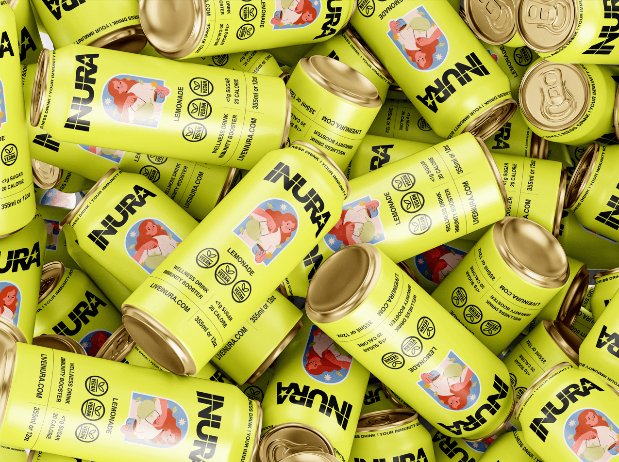
Trying an organic yet vibrant look for the lemonade can and information layout to showcase nutritional value.
Information Layout
presenting nutritional information in a more efficient layout format.
Information Layout
presenting nutritional information in a more efficient layout format.
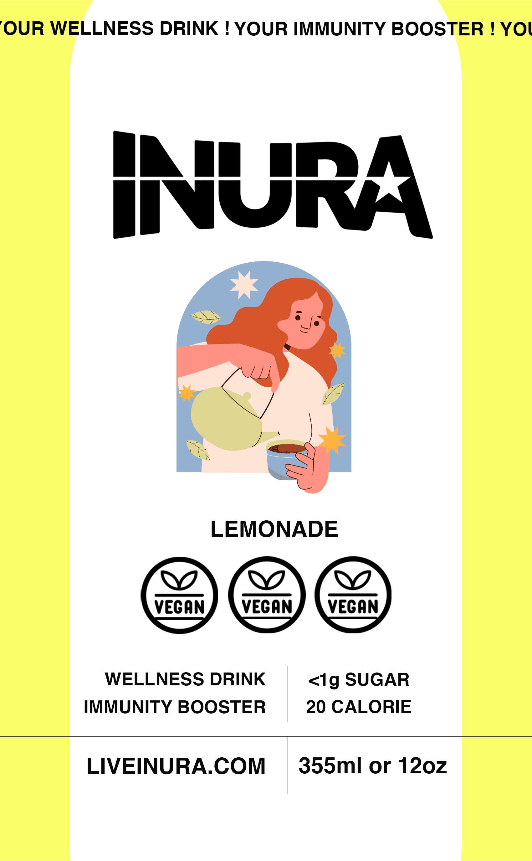
Creative Design
Playing with colors Illustrations and placement, adding more relevant information.
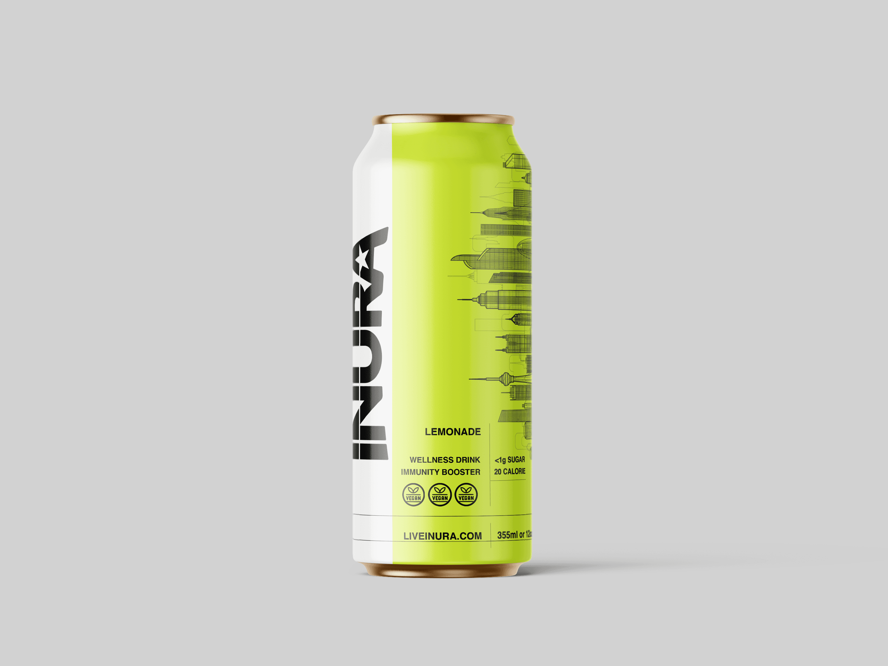
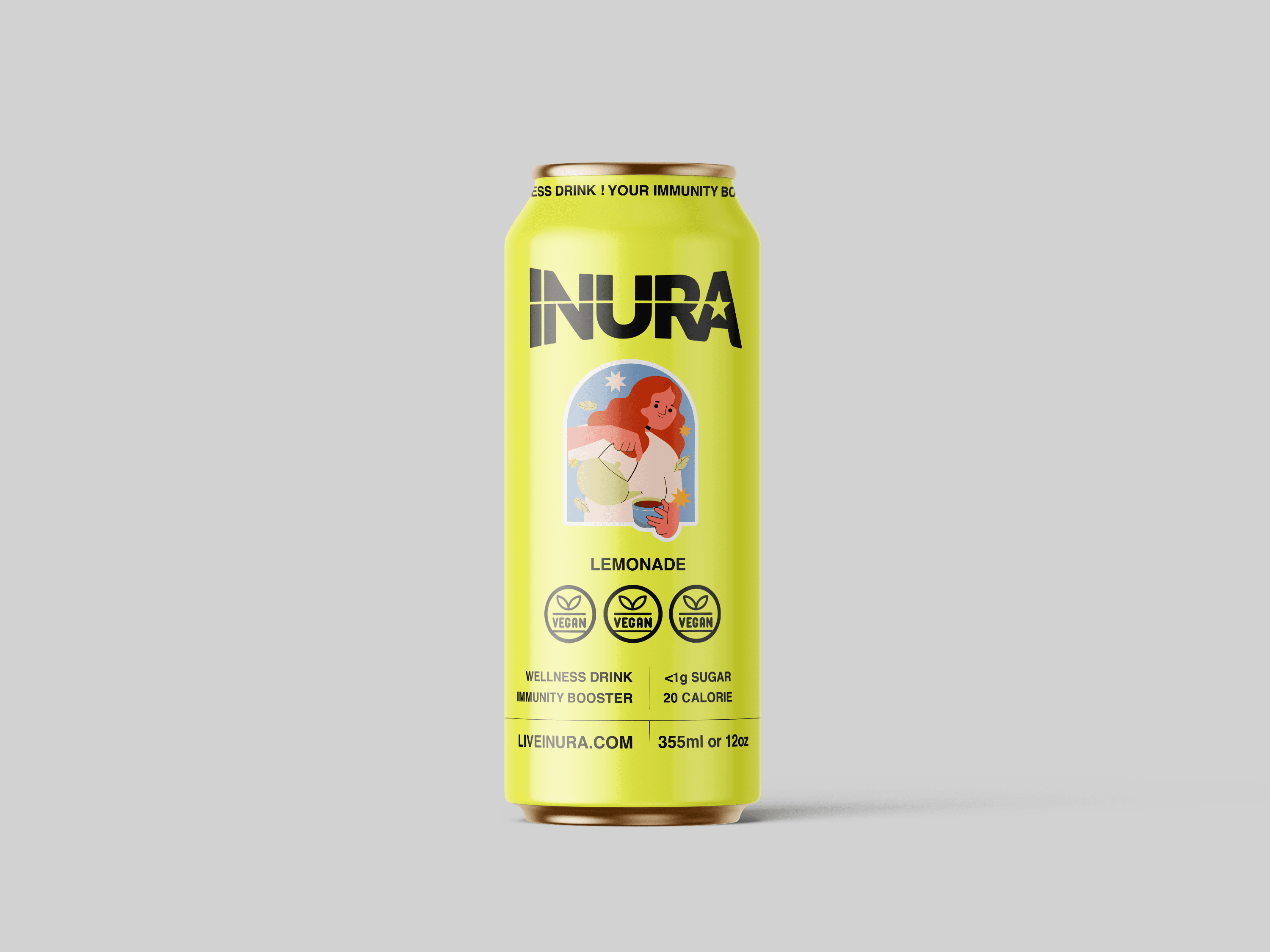
Final Concept
The client preferred this particular design concept, and the information was presented efficiently.
